Profile Pics How Much do you care about them?

I haven't had many over the years. I had Godzilla for awhile, an evil looking dog with red eyes. The Exorcist pic with the light streaming onto the priest. The Satanic wheel/Baphomet I had the last couple of years, and the new one which is just to tweak a few hyenas here on the boards.

I don't pay a lot of attention to them, except for Victoria's...the feet are distracting because I'm...me.
 
I don't really think about them that much. Altgough I had always been curious about Bramble Thorns old one. The one on my other account is a meme somebody made of me with some iphone app and posted in the Kik group. This one is just supposed to match my name.445f37bd4b3cfbd313489e5c97bfa81e.jpg
 
I think the Literotica platform makes the avatar less important (to readers). But I'd like to give my readers a feeling for what kind of content I create, particularly as I begin posting on Patreon. That should help weed out some people who won't like my content at all.

My profile pic gives an instant indication of what sort of stories I write...

So I agree with you. I can tell your stories are a bit less dark than many of mine-- and probably flirtier as well.
 
They just look like coloured blobs to me. It's much easier to distinguish people by username, seeing as that comes up in big blocky bold blue text.

Apart from Duleigh's dogs and a few people with tits or ass, I can't recall what anyone's avatar looks like. Mine doesn't show up that well, but I can't be bothered to change it.
 
My earlier avatars were rather too provocative. Or rather they maybe worked for me back then, less so now. I’ve gradually both toned them down and made them more personal. Though whatever flavor of image you go for, if it’s recognizably female, it will attract attention.

To be critical, my current one is a little too teenie for someone my age. But Hentai is kinda like that.

Em
 
I fell like mine gives a face, and therefore a more personal touch to the voice I write with. Maybe I'm wrong, but I also I think it helps my readers engage. I just wish it would eventually matriculate to this forum. The big S is kinda boring...
 
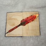
I don't really think about them that much. Altgough I had always been curious about Bramble Thorns old one.

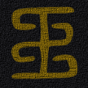
This one?

1702461470316.png

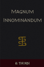
It's an obscure pun. One of my early stories here, "Magnum Innominandum", is a kind of pastiche/commentary on Robert Chambers' 1890s weird fiction collection "The King In Yellow" which also features the "Yellow Sign", a mysterious symbol of supernatural power.

I was publishing it to another site which required cover art, and I was casting around for ideas when I came across the symbol above, listed as an old form of the Chinese 王 (wáng = "king"). I thought it looked neat and fit the aesthetic I was going for, especially since 1890s European art had some heavy Chinese influences.

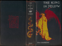
I found an image of the first edition cover of Chambers' book, and sampled the red, white, and yellow from that design to use in my own cover, though the texture I added afterwards ended up darkening them a little:
1702461509309.png

Screenshot 2023-12-13 at 8.48.06 pm.png

So the central glyph is literally 'king', in yellow. Har har. And that became my icon here for several years.
 
This one?

View attachment 2296254

It's an obscure pun. One of my early stories here, "Magnum Innominandum", is a kind of pastiche/commentary on Robert Chambers' 1890s weird fiction collection "The King In Yellow" which also features the "Yellow Sign", a mysterious symbol of supernatural power.

I was publishing it to another site which required cover art, and I was casting around for ideas when I came across the symbol above, listed as an old form of the Chinese 王 (wáng = "king"). I thought it looked neat and fit the aesthetic I was going for, especially since 1890s European art had some heavy Chinese influences.

I found an image of the first edition cover of Chambers' book, and sampled the red, white, and yellow from that design to use in my own cover, though the texture I added afterwards ended up darkening them a little:
View attachment 2296255

View attachment 2296253

So the central glyph is literally 'king', in yellow. Har har. And that became my icon here for several years.
No, the webcomic one. with the snarky muse.
 
Back
Top