nonlinear scale for visualizing story ratings?

joy_of_cooking

Literotica Guru
Joined
Aug 3, 2019
Posts
920
I was thinking about plotting story ratings and realized that I'd probably want a nonlinear scale. People care much more about the difference between 4.4 and 4.5 than they do about 1 vs 2. By the time you get into the rarefied 4.9s, people probably care about hundredths. (I assume. It's not as if I have any stories there.)

I know we have some nerds around. Anyone want to talk data visualization with me?

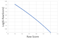
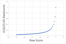
Maybe plot ln(6 - RATING) ? That seems pretty good: https://www.wolframalpha.com/input?i=log(6-x) About half the scale would be 3.3 and up, a quarter for 4.35 and up.

Thoughts?
 
The last time I used logs it was on a Post Versalog slide rule or if I wanted to be really accurate I looked them up in a text book. Even now, thinking about logs makes my head hurt.

I don't think you'll get much information out of a graph of ratings of any type because the genre seems to have as much to do with the ratings as the story content. What I think you'll find is the distribution of ratings for one particular genre is relatively normal but skewed to one side of the scale. Another genre will probably be the same but skewed toward the other end of the scale. It's just a reflection of what readers want to read and how they evaluate it. Also, remember that very few readers vote so the rating doesn't really tell you much about how readers reacted to your story. My current average is about 2 votes per 100 reads.

The other thing is that the rating can change over time, or at least mine do. They don't change by much, maybe 0.02 + orf - at the most, but they do change so your data will quickly become outdated.

What I track in order to improve my writing is the average rating of all my stories and how it changes from week to week. I also track the number of readers who follow me. I think in general, the number of followers indicates how many people enjoy what you write, and the average score indicates if you're getting better or not.
 
I was thinking about plotting story ratings and realized that I'd probably want a nonlinear scale. People care much more about the difference between 4.4 and 4.5 than they do about 1 vs 2. By the time you get into the rarefied 4.9s, people probably care about hundredths. (I assume. It's not as if I have any stories there.)

I know we have some nerds around. Anyone want to talk data visualization with me?

Maybe plot ln(6 - RATING) ? That seems pretty good: https://www.wolframalpha.com/input?i=log(6-x) About half the scale would be 3.3 and up, a quarter for 4.35 and up.

Thoughts?
What's your second axis? Rating by date submitted? Rating by word count? Rating by view count?
 
All I can say is that this is one more ratings thread where we will hear plenty of good suggestions that will get completely ignored by the website gods.

It's fun to discuss though, I guess.
 
Whelp, we've lost another good author to Rating Obsession.

Joy, it's sadly incurable, but they may allow you a black marker pen to write formulae on the walls of a cell - little tricky in a straight-jacket, but you'll soon get the hang.

(This from a man who once spent a week working out the most popular female names in each of the major Literotica categories)
 
Last edited:
I was thinking about plotting story ratings and realized that I'd probably want a nonlinear scale. People care much more about the difference between 4.4 and 4.5 than they do about 1 vs 2. By the time you get into the rarefied 4.9s, people probably care about hundredths. (I assume. It's not as if I have any stories there.)

I know we have some nerds around. Anyone want to talk data visualization with me?

Maybe plot ln(6 - RATING) ? That seems pretty good: https://www.wolframalpha.com/input?i=log(6-x) About half the scale would be 3.3 and up, a quarter for 4.35 and up.

Thoughts?
Depends on what your aim is in plotting them, the stories you're plotting, and your intended audience.

For instance, let's suppose I'm interested in stories in the "H" range, 4.50 and up. In this scenario, your proposed transformation is pretty close to a linear transformation: ln(6 - score) is approximately (5 - score), so it won't make much difference to how the data looks. (This is because for small h, ln(1+h) ~= h.)

Screenshot 2024-02-27 at 9.56.18 pm.png

You could magnify the differences between scores at the higher end of the range by applying other transformations. For instance:

1709031902671.png

But this might not be helpful.

Those ultra-high scores (say 4.95 and above) are very rare, so you're devoting a lot of real estate on your plot to a tiny handful of stories and squooshing the rest down into a smaller space. That's likely to make it hard to convey useful information to the reader.

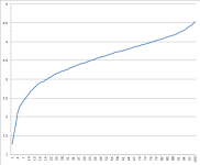
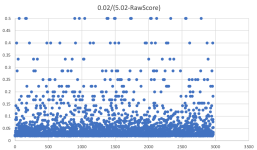
One of the big difficulties with visualising Literotica scores is graininess - scores are rounded to the nearest 0.01, shich means you end up with a whole lot of stories sitting on the exact same scores and big spaces between them. For instance, if you applied that (0.02/(5.02-score)) transformation to a bunch of stories, you'd see something like this:

Screenshot 2024-02-27 at 10.18.44 pm.png


And if you want to visualise the ratings of a single story or small group of stories over time, you end up with a bunch of abrupt steps that are difficult to interpret.

There are some methods that could be helpful in dealing with that, but it really depends on what you're trying to do. If I wanted to understand, say, how scores for a thousand stories compared at a moment in time, and I'm only interested in general patterns, the methods I'd use are quite different from if I was plotting a couple of dozen stories over time and I wanted to interpret my results at individual story level.

If I were to transform the scores, I'd probably be looking at mapping them to some sort of "quantile in category" value: replace raw numbers with a "this scored higher than X% of stories in the same category" figure. That would require a bit of work to estimate how scores map to quantiles, but it's doable, and it means you can then actually do something halfway meaningful in cross-category comparisons.
 
Alright, by popular request, thread boob-derailment proceeding in 1... 2... 5... I mean, 3!

C0EA6E2.gif
 
Derailment is in the eye of the beholder. I'd say you're right on track.
Okay, maybe someone has been shifted to a siding rail instead of derailed, but it's not clear yet if its the boobs or the stats that are on the running rail. It's a question freighted with uncertainty.
 
For instance, let's suppose I'm interested in stories in the "H" range, 4.50 and up. In this scenario, your proposed transformation is pretty close to a linear transformation: ln(6 - score) is approximately (5 - score), so it won't make much difference to how the data looks. (This is because for small h, ln(1+h) ~= h.)
That's a feature! My goal is more to compress the low end of the range than to expand the high end. As you say, there's not much population above 4.9 .
Depends on what your aim is in plotting them, the stories you're plotting, and your intended audience.
Well, at some level it was purely masturbatory, in that I don't have the technical skills to pull it off, but I was daydreaming about using user scripts (like greasemonkey et al.) to rewrite the Lit web UI.

The obvious improvement would be to obscure the red H in favor of a more continuous (but not necessarily linear) representation of the score. I really dislike the discontinuity at 4.5---what are the odds I'd notice the difference between a 4.50 and a 4.49 as I read it?

But you could also imagine

1. showing tags and more story metrics (views, favorites, comments) when listing stories in search results or author pages or favorites pages
2. letting people filter author pages and favorites pages by category (maybe via highlighting / greying out, so that multi-category series on author pages still make sense)
3. responsive layout? Browsing an author page or favorites page on a phone is pretty frustrating right now

But it's clear that the site owners have some combination of no resources and no interest in this sort of work. (Again, I'll emphasize that this isn't a realistic conversation, as I have neither the time nor the skills to do anything myself.)

Anyway, thanks for masturbating with me.
I'd probably be looking at mapping them to some sort of "quantile in category" value
This is a neat idea, by the way. I'd forgotten about LW. I'm sure other categories have their own, more subtle scoring quirks.
 
But it's clear that the site owners have some combination of no resources and no interest in this sort of work. (Again, I'll emphasize that this isn't a realistic conversation, as I have neither the time nor the skills to do anything myself.)

Anyway, thanks for masturbating with me.

No worries. How dull the world would be if we had to masturbate alone.

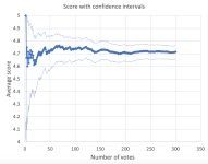
Not that anybody asked, but if I were plotting story scores, I'd be inclined to include some kind of uncertainty measures based on number of votes received. This kind of thing:

Screenshot 2024-02-28 at 8.56.22 am.png

I'd also consider factoring that uncertainty into things like toplist calculations - a 4.9 off 500 votes should probably beat a 4.91 off 50 votes - but that's more than I have time to get into just now.
 
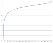
This is a chart showing the rating by percentile of stories 28 days after they were published since 8/30/2023:
1709073063080.png
4.0 rating is 16th percentile
4.5 rating is 53rd percentile
4.7 rating is 79th percentile
4.8 rating is 90th percentile
4.9 rating is 97th percentile

Each category should have their own chart. There should be a chart for stand-alone stories, chapter 1 stories, later chapters, and starter stories. Maybe I'll have the time at some point to do that.
 
Back
Top