Camille

CamilleLigari

Virgin
Joined
Nov 13, 2023
Posts
11
Hi!
I'm new here. So I introduce myself.
I'm an illustrator (erotica and porn) and I finally launched my site about a month ago : [Offsite Link Redacted]
Even if some series ("Monsters" and "Centuries") will soon be rebooted, here are some examples of what I do. I hope you enjoy it.
[Redacted] Even if I continue to post here, don't hesitate to send me a friend request or to follow me on these social networks.


Promotion of non Literotica sites is generally not permitted.
 

Attachments

  • Absinth001_TheWhip_web.jpg
    Absinth001_TheWhip_web.jpg
    751.7 KB · Views: 122
  • SoClose002_web.jpg
    SoClose002_web.jpg
    509.5 KB · Views: 113
  • Monsters002_TheAngel_web.jpg
    Monsters002_TheAngel_web.jpg
    1,015.7 KB · Views: 107
  • Lines_003_750.png
    Lines_003_750.png
    72 KB · Views: 96
  • Lines_001_750.png
    Lines_001_750.png
    60.7 KB · Views: 104
  • Centuries003_NYPD_web2.jpg
    Centuries003_NYPD_web2.jpg
    838.8 KB · Views: 111
  • Centuries001_Grognards_web2.jpg
    Centuries001_Grognards_web2.jpg
    879 KB · Views: 116
  • Absinth005_TheNavy_web.jpg
    Absinth005_TheNavy_web.jpg
    734.9 KB · Views: 116
  • Absinth002_TheBride_web.jpg
    Absinth002_TheBride_web.jpg
    743.6 KB · Views: 121
Last edited by a moderator:
They are indeed different styles but not so distant. I always work the same way: I draw on iPad from photographs (sometimes a lot for a single drawing).
 
I like your work. The first two seem vaguely inspired by the late Botero's works ...?
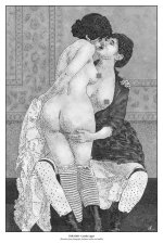
Thanks! The series "Absinth" is a compilation of images drawn from erotic and pornographic photographs of the 19th century. It’s almost a (spicy) documentary.
 
I think that you need to take more care in the 'drawing' and make it look more original. Also, take care to remove theimage credits from the bottoms so that the orginal website does not show
 
I think that you need to take more care in the 'drawing' and make it look more original. Also, take care to remove theimage credits from the bottoms so that the orginal website does not show
Thanks. I’m not sure to understand what you mean : You don’t like the "realistic" style, do you?
 
Thanks. I’m not sure to understand what you mean : You don’t like the "realistic" style, do you?
I think they're saying you should try to show the images more like original drawings, less like manipulated photos. The two "line" images look like drawn drawings, the others are too obviously derived from photographs.
 
OK thank you. It’s al’ weird feedback…Absinth is a series of drawings reproducing photos. That is what it is all about, and it is mentioned with every image. Lines and So Close are adaptations of stills taken from videos. Monsters and Centuries are creations for which I use reference photos (sometimes 15/20 for a single illustration). I won’t change a style that I have chosen, built and with which I am comfortable. But I understand whether we can appreciate or not. Peace:)
 
Please don feel rejected by some positive criticism. As an artist I get this all the time. Try to make it more "your's" by changing the origianl image to what you want it to be. I am sending an original coloured drawing and an edited one that can be altered more and coloured differently. Have fun with your art
 

Attachments

  • 10737675.jpg
    10737675.jpg
    46.6 KB · Views: 33
  • Demo_v.3.jpg
    Demo_v.3.jpg
    11 KB · Views: 32
Thanks for your concern. That’s exactly what I’m already doing: making the drawing I want it to be. Can we move on now?
 
Thanks for your concern. That’s exactly what I’m already doing: making the drawing I want it to be. Can we move on now?

I love your work. I don't know why, but I find artistic recreations more erotic... maybe it triggers the imagination more than a "this is literally a photo of an event"

Also, this thread is a bit of a cheese dream, do you guys phone restaurants and criticise the menu too?
 
I love your work.
Thank you so much TheF1x3r! Before closing this discussion, I want to insist because some posts can be confusing: apart from Absinth which is a claimed recreation and So Close an assumed adaptation, my works are complete creations that I draft and for which I use, like many artists, reference images. For example, I used between 10 and 15 reference photos just for my faun’s body (Monsters 003 - The faun). Let’s stop this useless exchange now, and have fun. As I said, I post a new image every week. From time to time I'll post one here too. This week I start with "Absinth 008 - The kiss".Absinth008_TheKiss_reseaux.jpg
 
Hi!
I'm new here. So I introduce myself.
I'm an illustrator (erotica and porn) and I finally launched my site about a month ago : [Offsite Link Redacted]
Even if some series ("Monsters" and "Centuries") will soon be rebooted, here are some examples of what I do. I hope you enjoy it.
[Redacted] Even if I continue to post here, don't hesitate to send me a friend request or to follow me on these social networks.


Promotion of non Literotica sites is generally not permitted.
These are all nice. I’m particularly drawn (not to make a bad pun) to the two pieces that are simple linework. Very clean, very minimalistic, but very good. Good is what you definitely want to strive for with minimalism. 👍🏻👍🏻👍🏻
 
These are all nice. I’m particularly drawn (not to make a bad pun) to the two pieces that are simple linework. Very clean, very minimalistic, but very good. Good is what you definitely want to strive for with minimalism. 👍🏻👍🏻👍🏻
Thank you very much. The series "Lines" is indeed all based on minimalism...
 
Back
Top