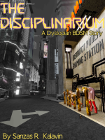
Second attempt at a book cover for Smashwords

Sanzas

Hello!
Joined
Jan 23, 2023
Posts
36
This is my second attempt at a cover for a 1st Smashwords novel. Some questions for those who know:
1. Is it the kind of thing they'd find acceptable? Does it need to be altered to be more audience friendly?
2. The story isn't BDSM in the consensual sense (the activity falls into that). Is there a better term for the description?
3. This fits one of the Smashwords Dimensions (at least it should). I have put title, author, and a 1-line description on it. Is there any other collateral that I should have.

NOTE: if you really like it or really hate it, let me know. I know it's "busy." I know the title font is "really sci-fi" in maybe not a good way. I'm open to suggestions there. I got good feedback last time (I have all the rights to this).

Let me know, Thanks.
--Sanzas


book1-1-small.jpg
 
I don't see how it fits book cover dimensions anywhere. I don't see any book covers on Smashwords with anything that wide compared to depth.

I think it's too busy and will be indecipherable in thumbnail size, and that would include the titling getting too small to pick out. Presumably the figures on the right edge are important, but they are lost in the busyness of the cover even in this size. To know how it will look in an e-book display, you've got to reduce it to thumbnail size (and I really do believe to standard book cover dimensions). Can't read what's in the triangle in the center even at this size and I'd get rid of the triangle no matter what is done with the rest. It distracts from any point the cover is making, I think.

in the subtitle, I'd drop "Science Fiction." That's fairly obvious and it's going to take up too much space when you get the title font big enough to read in thumbnail.
 
I have no clue whether SW would allow BDSM on the cover, but I don't think the main title goes with the graphic at all. I'd use the same font as for the subtitle, shrink your name, get rid of "by", and close the gap between R. and Kalavin. Should be the same space as between "as R."

I reckon there are too many fonts competing with each other, and I'm not sure about the bright splashes of colour either, given the overall muted image. The people are lost in darkness - I didn't see them straight away.

It's very busy (too busy, to my eye), but there's actually nothing important in the centre of the image. Everything is around the outside. The mocking zone triangle doesn't look like it's in the cityscape, it's too obviously drawn over the primary image, but the text is too small to read without zooming in.

I know you've used a SW dimension for the cover, but imagine it as a thumbnail, because that's what potential buyers will see in the "bookshop". I think you need to simplify the image considerably - it's an ebook cover that will be seen "small", not a movie poster, and will become a grey blob when it's smaller.
I'll think on this. It's good feedback, I'm just not sure I have too many other ideas. I do agree that the concept wasn't great for a thumbnail which is something I didn't think about until tonight.
 
I'll think on this. It's good feedback, I'm just not sure I have too many other ideas. I do agree that the concept wasn't great for a thumbnail which is something I didn't think about until tonight.
Check out other covers in the sci-fi genres, as well as erotica.

A big part of your dilemma is that you're targeting a niche audience but you've got Bladerunner style sci-fi on the one hand and bondage erotica on the other, and it's not clear which comes first.
 
Make the three women in pillory the lower 2/3 of the cover in a straight-on angle to the wall. They are what the story is about. Feature them front and center.

And take out the shaming station text, and the pipes.

Then place your title and byline in the blank grey concrete area above their heads in the up 1/3 of the cover.

It simplifies the cover, makes the subject matter very obvious.

You don't need to see the rest of the city street, it's not important to getting the point across.
 
My only suggestion, and I cannot pretend to be an artist or designer of any kind, is to shrink that image down to around 200 pixels tall and see how much of the text and image you can still make out. Because that is all potential customers at Smashwords will see, on a crowded page, while browsing.


ETA: I hope you don't mind, I went ahead and did that as an example. This is more or less what it would look like in the Smashwords store:

1678710930827.png
 
Last edited:
Maybe you should ask your questions about other story-website related issues on those other websites instead of Lit.
There are people here who have published erotica on Smashwords. I learned about Smashwords here (in these forums). I haven't done this before and I've gotten helpful advice here.
 
There are people here who have published erotica on Smashwords. I learned about Smashwords here (in these forums). I haven't done this before and I've gotten helpful advice here.
Yeah, that's fine. I have a couple of hundred book covers on Smashwords, Amazon, etc.
 
Make the three women in pillory the lower 2/3 of the cover in a straight-on angle to the wall. They are what the story is about. Feature them front and center.

And take out the shaming station text, and the pipes.

Then place your title and byline in the blank grey concrete area above their heads in the up 1/3 of the cover.

It simplifies the cover, makes the subject matter very obvious.

You don't need to see the rest of the city street, it's not important to getting the point across.
I tried this--seems better (I also used a different set of dimensions--but also off Smashwords)book1-4-small.jpg
 
Better, but I think you might want to look at the color contrast between the title and the background image...

1678738061420.png

You also have text of a similar size in the image and the title is running over it in a visually confusing way.
 
Something to consider, if you have a sub title on your cover, Smashwords has this thing where the cover has to match the title completely. So your title would have to have the sub title next to it in the title field.

Again, it will sell on SW but not get through premium if you don't do it this way.

I would drop BDSM from cover and title and use it in the search tags, it will get less scrutiny that way. That's just my two cents on the subject.
Good to know. Thanks. I'll do that.
 
Back
Top