How to format "computer text" in a Lit story

I have mixed feelings about the <i>-<em> autoconversion. I suspect on average it's improving the coding of stories, since most of the stuff tagged as <i> really ought to be <em>. But it does introduce errors in the other direction, when italics are being used for purpose other than emphasis.
That is an important point. The i tag is to specify italics. Specifying style like italics inline is deprecated in many cases, but it's not invalid HTML.


On the other hand the em tag is specifically only to indicated emphasis. Typically this is shown as italics but not always. However it is semantically invalid HTML to use the em tag to wrap a foreign word, for example, or even inner dialogue.

But regardless, devs and webmasters blanket replacing i tags with em tags did become the done thing with the big rush to HTML5 about 2008-ish. Unfortunately that now means there is now precisely as semantically inaccurate a situation as there was before, as em tags are used where they ought not to be. Only now we have two different tags...
 
Mogrem - thanks for the explanation and I do not mean to argue, but I haven't seen a difference between <i> and <em> when used on this site. Is there one, in terms of what the reader sees?
 
Mogrem - thanks for the explanation and I do not mean to argue, but I haven't seen a difference between <i> and <em> when used on this site. Is there one, in terms of what the reader sees?
No, I'm mostly being a standards pedant to no purpose. It was said above that the site auto changes i tags to be em tags; in that case there is nothing for the author to concern themselves with. The only way it matters is if the author keeps the text file source document as HTML and in future want to convert it to epub format for proper publishing. In that case you would be doing your typesetters a very small favour by properly distinguishing between italics and emphasis.
 
No, I'm mostly being a standards pedant to no purpose. It was said above that the site auto changes i tags to be em tags; in that case there is nothing for the author to concern themselves with. The only way it matters is if the author keeps the text file source document as HTML and in future want to convert it to epub format for proper publishing. In that case you would be doing your typesetters a very small favour by properly distinguishing between italics and emphasis.
Interesting. Permit me a further question then. How do the two differ visually 'normally'?
 
Mogrem - thanks for the explanation and I do not mean to argue, but I haven't seen a difference between <i> and <em> when used on this site. Is there one, in terms of what the reader sees?

For most of us there is no visual difference, but it can be relevant for assistive software like screen readers (text-to-speech). An <em> indicates text that should be stressed when spoken, e.g. by a slight increase in volume or with a slight pause before and after; an <i> does not.
 
Interesting. Permit me a further question then. How do the two differ visually 'normally'?
For most of us there is no visual difference ...
Emphasis is a semantic description of the meaning of the text, whereas italics is a style that can be used in all sorts of circumstances. 'Normally' emphasis is visually shown in italics, so, as Bramblethorn says, they are visually identical. But that normal isn't a universal given.
... it can be relevant for assistive software like screen readers (text-to-speech). An <em> indicates text that should be stressed when spoken, e.g. by a slight increase in volume or with a slight pause before and after; an <i> does not.
Of course in practice screen reader developers and screen reader users are used to the two tags being mixed up and used haphazardly.
 
For most of us there is no visual difference, but it can be relevant for assistive software like screen readers (text-to-speech). An <em> indicates text that should be stressed when spoken, e.g. by a slight increase in volume or with a slight pause before and after; an <i> does not.
Plus, anyone can write a stylesheet which does visually distinguish between them. I rather wish more people would. Just because the default is visually identical doesn't mean it should be, given the semantic differences.
 
For most of us there is no visual difference, but it can be relevant for assistive software like screen readers (text-to-speech). An <em> indicates text that should be stressed...
What an interesting discussion of <i> and <em> this turned into! Did not know that about text-to-speech readers.

I use italics (crafted in Word and uploaded) a lot for emphasis (see what I did there?). Probably too much, but I also want a different kind of emphasis sometimes. I found this example in a chapter I'm proofing at the moment, and it's not the best one to make my point, but:

And if she was a ‘good friend’ of Nia’s, then maybe sometime Nia would share her with me sometime. Mmm, mmm, mmm!


Basically where you might physically (or verbally) use air quotes, what do you all do for that?

Now that I've pasted it here, italics might've worked just as well for 'good friend.'

But what about this, off the top of my head:

You're my best friend.
You're my 'best' friend.
(Physically say those to see what I mean, using air quote fingers for the last one.)

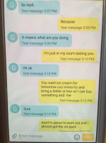
And I need to try <kbd> for text messages, which my young lovers use a lot, even in 2005. (I was using computer-y fonts, not realizing until just now that those don't work.)
Thanks.
 
Last edited:
What an interesting discussion of <i> and <em> this turned into! Did not know that about text-to-speech readers.

It's not a technology I use myself, so I'm not certain how many of them currently do distinguish between the two, but that's the kind of thing it's meant to support.

I use italics (crafted in Word and uploaded) a lot for emphasis (see what I did there?). Probably too much, but I also want a different kind of emphasis sometimes. I found this example in a chapter I'm proofing at the moment, and it's not the best one to make my point, but:

And if she was a ‘good friend’ of Nia’s, then maybe sometime Nia would share her with me sometime. Mmm, mmm, mmm!


Basically where you might physically (or verbally) use air quotes, what do you all do for that?

If it's being used euphemistically, and the intent is to signal that it shouldn't be read literally? I'd just use quotes there.

And I need to try <kbd> for text messages, which my young lovers use a lot, even in 2005. (I was using computer-y fonts, not realizing until just now that those don't work.)

Noting that although <kbd> worked for me, it's not listed in the formatting guide Laurel linked, so I'm now uncertain whether it's something that works automatically in submission or if it's something she enabled manually for that story. It does show up in preview though, which leads me to think it might be an undocumented feature rather than Laurel's intervention.
 
If it's being used euphemistically, and the intent is to signal that it shouldn't be read literally? I'd just use quotes there.

Noting that although <kbd> worked for me, it's not listed in the formatting guide...
Yeah, quotes are probably best.

For some reason, either in high school or middle school, I latched onto using single quotes like that, not sure why. I know how to use double quotes, the normal ones, but I like the singles for instances like that I guess because they're less bulky or something. A weird habit I should probably break.

I'll edit and resubmit one of my chapters with text messages in it using <kbd> and see what happens. I'll post back here if it works, but I recognize that that could change at any time.

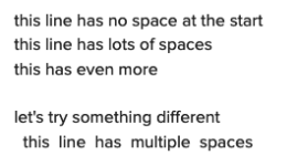
Another thing I learned from the formatting guide is that tabs get stripped, and that's what I was relying on to try to show texts how they are on a phone screen, sent ones right-justified, received ones left-justified. Like this:

Hey, how are you?
Good, thanks.
Cool.

I think spaces work okay for that though and always should.

Multiple spaces will usually be ignored in HTML. Instead I'd recommend <p align="right">Right Aligned Text Here</p>. Left-aligned is default so no need to tag that, just make sure to close out the right-aligned bits with </p>.
 
Multiple spaces will usually be ignored in HTML. Instead I'd recommend <p align="right">Right Aligned Text Here</p>.
I guess I need to go back and see how my chapters have been publishing, because I thought the manual spaces were staying, but I'm probably wrong.

You mentioned Preview earlier and I didn't know what you were talking about until I published my latest installment and looked for it. "Preview and Publish" is what the button says, but because I've always uploaded a .doc/.docx I guess I never got offered a Preview? So you only get that if you paste into the box I guess?

Right-align could work, but I think it would end up not looking much like a phone's screen because it's too wide:

20+ pairs of shoes???​
What? A girl’s gotta have shoes! ;-)
I don’t know how you get by with just 3!!
See ya tonight?​
Oh yeah!

What I want is something more like this:

........20+ pairs of shoes???

...What? A girl’s gotta have shoes! ;-)
...I don’t know how you get by with just 3!!

........See ya tonight?

...Oh yeah!

(Crap! The FORUM strips leading spaces! I typed those manually indented 3 spaces and 8 spaces, but it stripped them. And TAB doesn't work, or Ctrl-TAB. Even putting a period followed by spaces, those get stripped. So I put ALL periods just to show what I'm after. Grrr.)

The ones indented more are me, the sender. And of course the lesser-indented are the replies. But I want to indent those too so the whole text exchange kind of looks separate from the story.
"No tabs" makes that hard, and if "no spaces" is the rule too, then maybe I can't do it. Other than using left/right justification.
(We probably can't do Text Color either? I could make the periods white.)

Something like this inane exchange. I know we can't have colors, but that sort of left/right idea, overlapping in the middle. If Tabs or spaces would hold I could use carriage returns to get the blocky look.
1691461719080.png
 
Last edited:
You mentioned Preview earlier and I didn't know what you were talking about until I published my latest installment and looked for it. "Preview and Publish" is what the button says, but because I've always uploaded a .doc/.docx I guess I never got offered a Preview? So you only get that if you paste into the box I guess?

Sorry, yeah. If you upload a .doc/x, it will get converted into HTML, and HTML ignores extra spaces etc. If you use the text submission box, you have a bit more scope to micromanage formatting by doing your own HTML tagging. All the info I posted above assumes doing it this way, not as an attachment.

Right-align could work, but I think it would end up not looking much like a phone's screen because it's too wide:

Could do - it'll depend on how wide the user has set their browser window.

(Crap! The FORUM strips leading spaces! I typed those manually indented 3 spaces and 8 spaces, but it stripped them. And TAB doesn't work, or Ctrl-TAB. Even putting a period followed by spaces, those get stripped. So I put ALL periods just to show what I'm after. Grrr.)
Something like this inane exchange. I know we can't have colors, but that sort of left/right idea, overlapping in the middle. If Tabs or spaces would hold I could use carriage returns to get the blocky look.

If you just want to add a few extra spaces you can do this with the text submission box, if you're patient. Instead of hitting the space bar, write "&nbsp;" (without the quote marks but with the & and ;). This specifies a non-breaking space. For instance, here's what I put into the text box:
Screenshot 2023-08-08 at 3.33.40 pm.png

And here's how it looks in preview:

Screenshot 2023-08-08 at 3.32.58 pm.png
Similarly, you should be able to use <br> to specify line breaks.

But space-indenting is a pain in the neck and is likely to leave you with a ragged right margin, like this:

Screenshot 2023-08-08 at 3.48.35 pm.png

Using <p align="right"> gives this instead, which is a better match for how text messages generally appear.
Screenshot 2023-08-08 at 3.50.02 pm.png
 
Could do - it'll depend on how wide the user has set their browser window.

If you just want to add a few extra spaces you can do this with the text submission box, if you're patient. Instead of hitting the space bar, write "&nbsp;" (without the quote marks but with the & and ;). This specifies a non-breaking space.
Duh, I'm a boomer and it didn't occur to me that people probably read Lit on their phones. In fact I was just reading an older thread yesterday that said probably over half.

The forum submission box or something got you and turned your semicolon into a winky face. I think that's hilarious given what we've been talking about, but I know what you mean, and I think &nbsp; might just do it for me, so thanks for illustrating that in your post.
As for being clunky, my middle name is OCD, and with <br>'s I should be able control the right margin and get that blocky look when it's needed.

I tried it here in the Message box but it doesn't work, so I guess I need to play with it in the Submission text box and check the Preview. I'll let you know how I get on.
Thanks again for your help!
 
Last edited:
...so I guess I need to play with it in the Submission text box and check the Preview. I'll let you know how I get on.
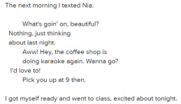
I think it's going to work! I don't need it to be exact, I'm just trying to avoid having to label each line as to who's texting.
cell text snip.png
The 2nd & 3rd messages are where I did a <br> to sort of keep the lines equal length.
What do you think?

It's not perfect, and never will be without colored blocks. And actually, my characters are in 2005, so they don't have smart phones and their texts are probably just rows of dot-matrix characters.
Oh, and I think the "ragged right margin" is okay, because that's how my phone displays texts.
But I think the above sort of shows the intent in a way that people can understand. I did have to say right before it that I was "texting Nia," but with the understanding that the first line, indented farther right, was me, I think it's pretty clear.

And an interesting thing: for some reason the &nbsp;'s aren't all counting. I first did 6 for the sender and 3 for the receiver, but wanted more separation so I went to 10 and 2. But you can see that I'm only getting about a 4-space difference.
It doesn't matter for this, but any idea why that is? That's screenshot from the Preview screen in Submissions.
 
Noting that although <kbd> worked for me, it's not listed in the formatting guide Laurel linked, so I'm now uncertain whether it's something that works automatically in submission or if it's something she enabled manually for that story. It does show up in preview though, which leads me to think it might be an undocumented feature rather than Laurel's intervention.
I can't speak to 'kdb,' but in general having it show up in preview is not a guarantee of anything. I tried some 'non-approved' tags a few years ago, and it looked brilliant in preview, but then got the story sent back as rejected because of them.
 
I think it's going to work! I don't need it to be exact, I'm just trying to avoid having to label each line as to who's texting.
View attachment 2259386
The 2nd & 3rd messages are where I did a <br> to sort of keep the lines equal length.
What do you think?

That could work, if you're keeping the lines short. I just get twitchy about space-indenting; that kind of thing is fragile under editing. But if you're willing to put up with that, your choice. I did use it once for Loss Function because that involves a chat transcript with a piece of ASCII art that requires the spacing, not something I'd suffer on a regular basis.

And an interesting thing: for some reason the &nbsp;'s aren't all counting. I first did 6 for the sender and 3 for the receiver, but wanted more separation so I went to 10 and 2. But you can see that I'm only getting about a 4-space difference.
It doesn't matter for this, but any idea why that is? That's screenshot from the Preview screen in Submissions.

I think what you're seeing there is that in that font (as in most), different characters have different widths. It's probably not that your spaces aren't counting, but just that each space is a bit thinner than the average letter, so six spaces works out about the same as four letters, depending on what those letters are.

iiiiiiiiii<- 10 "i"s
WWWWWWWWWW<- 10 "W"s
W W W W W W W W W W <- 10 "W"s and ten spaces (including the one at the end before the <)

On normal browser settings, you should see that the "W"s are more than twice as wide as the "i"s, and that the total width added by ten spaces is pretty small - probably about the same width as the "i"s.

For things like programming, we'd normally use a monospaced font, which means that every character has the same width. Exact same text in Courier, a monospaced font:

iiiiiiiiii<- 10 "i"s
WWWWWWWWWW<- 10 "W"s
W W W W W W W W W W <- 10 "W"s and ten spaces (including the one at the end before the <)


But that's not how Literotica usually displays.
 
I can't speak to 'kdb,' but in general having it show up in preview is not a guarantee of anything. I tried some 'non-approved' tags a few years ago, and it looked brilliant in preview, but then got the story sent back as rejected because of them.
Thanks for pointing that out. I wasn't aware that 'other' html tags would work in Preview (but not in submission). However, I've learned enough in the forums to know that most html tags won't work for a story, and only mentioned <kbd> because a few said it worked for them.
And Bramblethorn said &nbsp; works, so I'm focusing on that.
And I haven't tried this yet, but in researching &nbsp; I found that &ensp; is supposed to give 2 spaces, and &emsp; 4. Generally; don't know about Literotica.
I think what you're seeing there is that in that font (as in most), different characters have different widths.
I hear you (and thanks for laying all that out so nicely; you're very good at that), but I don't think that's the case here.
I said I STARTED with 6 spaces, but I ended up at TEN, with the replies at only 2. So there should be a delta of 8 spaces between lines.
But count the characters in "Nothing" until you get to the W in "What's." Four.
And the line below that: "About" to where it overlaps "Awww": Four, really closer to 3 and a half.
And those are a mix of (admittedly 'wider') characters.
But "I'd love to" overlapping "Pick" demonstrates nicely what you're saying, with the i, the apostrophe, and the L being skinny characters. So there's an overlap of almost 6 characters.

But more importantly (I'd have to test this again to be certain), the relative spacing didn't change when I went from 6 to 8 to 10 non-breaking spaces before the Sent messages. If that's true, then hmmmm.
 
Back
Top